


When it comes to stationery, designing is only about half the job (if that). Printing is an entirely different beast! It can be hard to master, even if you have experience with graphic design. So today I’ll talk about how to prep your stationery files for print!
The basic guidelines for setting up your files for printing are as follows:
- Save each page as a PDF
- Make sure your file is in CMYK
- Ensure your images are all 300dpi or larger
- Outline all text
- Make sure you include ⅛” to ¼” bleeds on all 4 sides
- Add trim marks if needed
- Ask your printer for any other specific instructions, if needed!
Let’s go over what each of these steps means when it comes to printing your invitations and stationery!
What File Type do you need for printing invitations?
The best file type for printing invitations is PDF. Each individual card or page should be saved as a 1-page PDF. If you are printing front and back, you can usually save those as a 2-page PDF, with front and back as individual pages.
Why do you need a PDF? It’s a “lossless” file type that will retain everything exactly as it is in the original file. Printing a JPG or PNG file is prone to losing some data, especially when it comes to text and fonts. If there are options to change image dpi, make sure you set it at 300 or higher. More on this later. Do not use compression unless you know what you’re doing!
Why do you need to Print in CMYK?
CMYK and RGB are the main design color spaces. CMYK is used for printing, and RGB is used for screen graphics. A lot of programs like Canva will have you designing in RGB since they are made for on-screen graphics. CMYK and RGB are totally different spectrums. You don’t need to fully understand the science around it, but just know that RGB designs are made to have light pushing out from behind them. CMYK designs, on the other hand, are made to compensate for the paper absorbing light. So the colors are a little different in RGB and CMYK.
For printing your stationery, you need to be in CMYK all the time. Understand that some colors you can access on screen will look different on paper. Specifically, really bright colors especially in the pink and blue ranges.
If you print an RGB file, it will likely appear darker than expected. So make sure to convert your files into CMYK before printing! For the best results, however, you do want to start your design in CMYK, because sometimes those conversions can change your colors a bit. This is why professional graphic designers usually design in programs like Adobe Illustrator and InDesign where you can design directly in CMYK.
Make Sure Images are at 300DPI
You’ve surely seen “pixelated” or “blurry” images printed on things before – no one wants that on your stationery! When that happens, it’s because the image did not have enough pixels. Think of pixels as a grid of squares that make up your image. If you zoom in, you see the squares. If you zoom out far enough, then you don’t see the squares, they pretty much fade into an image.
So the best measurement for printing images that won’t look blurry is 300dpi which is 300 dots per inch, or ppi, which is pixels per inch. An important note though, is that they need to be 300dpi at the size you are printing them. If you design something at 5×7, and the image says it’s 300dpi, then you try and print it on a billboard…it will have to blow those pixels up really big and you’ll get lots of pixelation. So just because your photographer sent you a photo and said it was 300dpi doesn’t necessarily mean it will print well – it needs to be 300dpi or more at the size you plan to print it!
What are Vector Images?
Images made with pixels are called “raster” images. Vector images, on the other hand, are made with math! Specifically, something called “Bezier curves”. I won’t go into the math, but just know that it’s calculating where points on a path are in location to one another. And if you blow that path up 100x, then the points are still calculated with the same math, so the overall shape will still look the same.
For some stationery printing, vector images are required. This is usually for any printing where a die will be made – letterpress, foil, engraving, or embossing are the common ones. All fonts are by nature vectors and can be blown up as much as you need them too. The main place you run into issues is with raster images like watercolors, paintings, or photos. Generally, if you’re doing flat printing, you don’t need to be too concerned with vectors. If you want to learn more, here is a video on Raster vs Vector images!
Why do you need to Outline Text for Printing?
One thing you do need to be concerned with though is outlining your text! If you’ve ever used a text box, you know that that box is editable – you can change the text at any point if you need to. Because of this, sometimes text boxes don’t “set” the text into the design. If you send your design to someone who doesn’t have the same font installed, then sometimes it’ll replace that text with an error, or a totally random other font.
Outlining the text “sets” the text in place – it will print better, it won’t accidentally get replaced with anything else, but keep in mind that it also will no longer be editable. You should always, always, always save a “print ready” version of your file before outlining the text in case you need to edit the text on the design in future!
How to Outline All of your Text
In programs like Canva, you typically will look for a download setting called “Flatten PDF”. This will outline the text for you!
If you are using Adobe, you can select all the text boxes and right click, and there should be an option for “Create Outlines”.
In some programs, you might have an option to outline text when saving as a PDF.
If you’re working with a data merge file in InDesign, we offer a script that will outline all of your text for you before exporting! No more Adobe Acrobat Preflight needed. Snag the script here, and watch a video about how to use it here!
What is Bleed on an Invitation?
Okay, to explain a bleed, I need to explain digital printing a little. When printers print files, they can’t really print all the way up to the exact edge of the page. So instead of printing your file on a 5×7 card, for instance, they print on a larger piece and cut it down to 5×7. This is cheaper, faster, and a better way to print as well.
The issue is that when you are doing flat printing, there can be a slight bit of shift in where the print actually happens on the page. It might shift anywhere from 1/64” all the way up to about ¼”. Standard is usually around ⅛”.
So if you design something that goes riiiight up to the edge of the invitation, but it shifts ⅛” in printing, and then is cut to the 5×7 size, then your design may no longer meet up perfectly with the edge of the invitation. You might get a little white area where the design stops right before the edge of the card – no one wants that.
What we do to prevent this is use a bleed!
How to Design Invitations with a Bleed
For any part of the design that goes to the edge of the card, you want to actually extend the design at least a little further – in most cases ⅛” works well but ask your printers for their recommendation. Anything within that “bleed area” could potentially get cut off when the paper is trimmed down. So if it’s a watercolor floral element, just make sure it goes all the way to that bleed, not just to the edge of the final card size, and make sure that nothing important is included in the bleed area!
One time I accidentally included the teeny tiny couple in a large tri-fold watercolor image a little too close to the bleed and they got cut off – whoops!
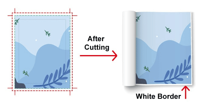
Here’s an image from Qin Printing that shows what happens if you don’t extend the design to the bleed line. If the design had been extended to the red line, you wouldn’t get that weird white border on the final print.
If your file includes correct bleeds it should be a little larger than your actual cut size. For instance, if you are printing a 5×7 and need ⅛” bleeds on all 4 sides, then your file will be ¼” bigger in each direction (⅛” left, ⅛” right, ⅛” top and ⅛” bottom). It will be a 5 ¼ x 7 ¼” file.
What are Trim Marks?
Trim marks are not required by every printer, but they might be by yours. If you’re printing in-house they will be extra helpful!
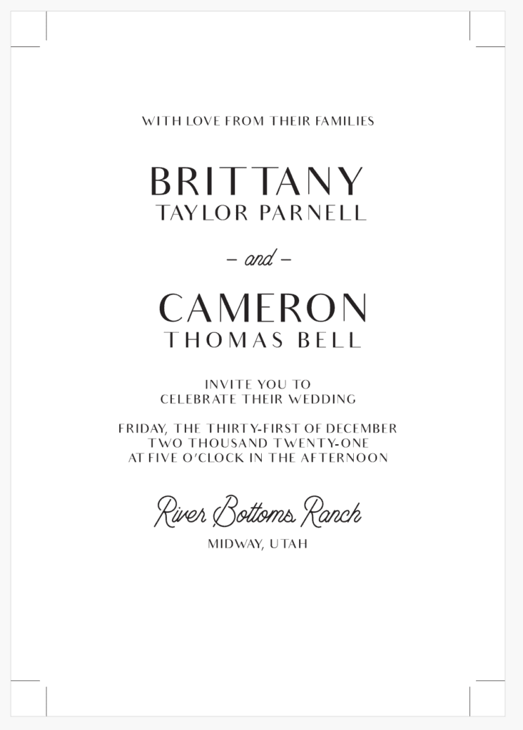
Trim marks are basically small marks that show exactly where to cut your file on all 4 corners. They are outside of the file itself, and give you marks to use when cutting. Here’s what they look like:
How to add Trim Marks to Your Invitation Files
If you’re designing in Canva, you can add bleeds and trim marks in the download settings. You can add them automatically when saving your file from Adobe programs.
If you need to add them manually, you can do that as well! I prefer to use a square vs. 2 lines, because it’s easier in my opinion. Just make your canvas background a little bigger and put 4 squares, 1 in each corner. You want to move each square outside of the actual file so it doesn’t print ON the stationery, but just outside of it. But you still want the bottom and side of the square to line up with the edges of the card so that they provide a guide to cut by!
Overall, it can be tough to prep your files for print, but once you understand the ropes you are sure to print some gorgeous stationery! For all our favorite printing vendors – check out this free Toolkit!
Leave a Reply


Behind the scenes with your favorite Stationery Auntie Laney (and all the inside scoops!)


