Affilate Marketing
All Things Printing
Business Resources
CRMs and Systems
Marketing
Tips & Tricks
Hi, I'm Laney!
I make wedding invitations and I teach artists how to work smarter, make money, and run a business that works for you.
We'd love to have you join us - signup for our email list to get DBL updates, stationery design tricks, business tips and more!
Print designers – this one’s for you! I searched for years for a printable CMYK color chart, and couldn’t ever find the right tool. So I finally sat down and created it. If you’re not sure yet how this is helpful to you, trust me, you’re gonna want to read this.
Why a CMYK Color Chart?
As you know, we generally use CMYK color values for printing our designs. But when you’re printing digitally, those CMYK values are handled in all sorts of different ways. Here’s a photo of the same exact CMYK value printed on 3 different printers:
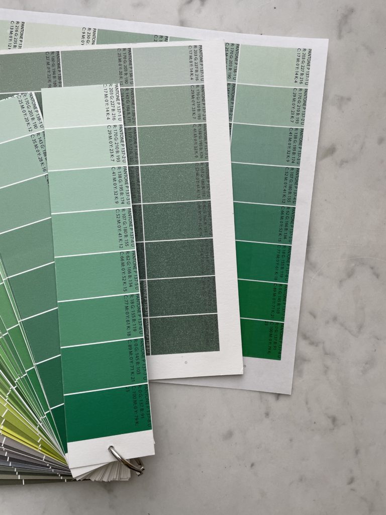
Certain colors are especially tough to print digitally – blue, green, and gray to name a few. Plus, matching colors to things like bridesmaid dresses, paint swatches, or anything else your design draws from can be really tough. You never know how your colors are going to print when you send them out to your printer! It’s even tough if you print in-house, because you have to run all kinds of color adjustments to get your printer to print colors correctly or match something printed elsewhere.
In my business as a stationery designer, I use different printers on the same projects all the time. What I found was that the same CMYK value printed across several vendors could end up looking completely different – and that led to a frustrated designer and an unhappy client.
The solution I searched for was a large palette of colors that I could print out from my main printers, and keep on hand to see how those machines handled colors differently.
Why not a Pantone Color Chart?
People have suggested Pantone books, of course, which I am well aware of and have used for years. Pantone books are great when you have control of the mix of ink. I use PMS Values for Letterpress Printing, Offset Printing, Screen Printing, and other mixed inks.
But when you’re printing digitally, a PMS color value doesn’t have any consistency across machines. The printers themselves don’t really have control over what colors go in, so each machine will produce a different result with the same color codes.
What I needed was a printable color chart PDF, with CMYK values on each individual swatch.
Enter The Printable Palette
After years of searching, I decided to make this tool – The Printable Palette. I learned how to write an Illustrator Script in order to get each swatch with its corresponding CMYK and RGB color values on it.
I spent hours laying out the color matching printable so that it would be as simple to use as possible.
What is The Printable Palette?
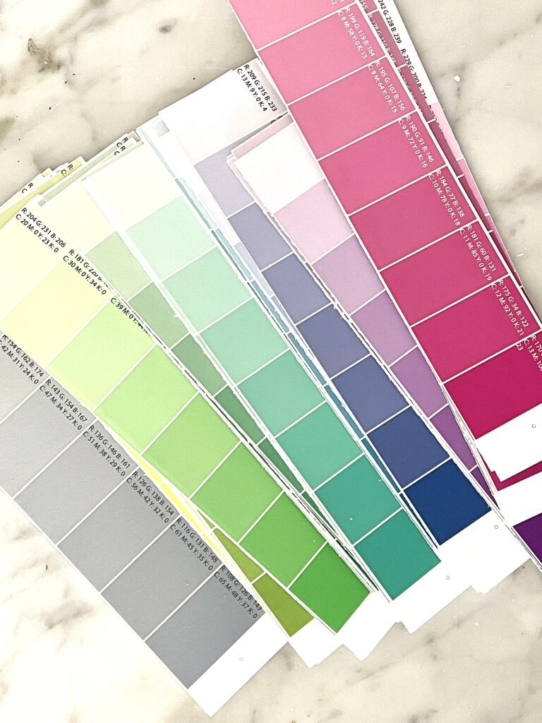
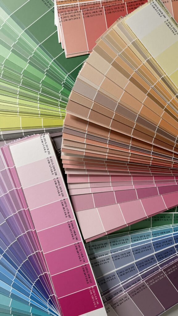
At it’s core, The Printable Palette is a color matching tool for digital printers. Physically, it’s a file that you’ll get with 1,300+ color swatches, all including CMYK and RGB values right on the swatch. It’s set up in 8.5×11 format, ready to print. It’s a literally a Printable CMYK Color Chart PDF! Learn more about the different color spaces in this video!
This isn’t rocket science, it’s something you could do yourself – but it took me about 12+ hours to put together (even with a script doing the heavy lifting). So treat yourself and use that energy on something else.
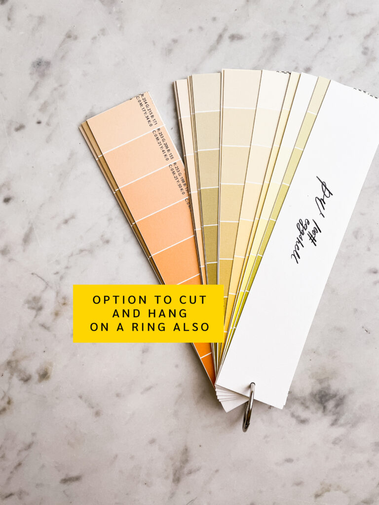
You have rights to print it wherever you need to print it – if you mostly print in-house, run a Palette on each of your printers. If you have a couple print shops you use, run a Palette from each. I ended up doing 3 (my main print shop and my 2 in-house printers).
You can cut it up, hole punch (dots provided as a guide) and put it on a ring (I recommend 3″) so it looks like a Pantone deck. Or you can just stick the 8.5×11 color chart in a binder and flip through them when you need to match a color.
How does this Color Chart Work?
This printable CMYK Color Chart works like this:
- Print the Palette from your main print shop (on your preferred paper)
- Next time you’re designing, pick the resulting colors that you want from the printed palette
- Note the CMYK codes of that color, and use those in your design files
- Voila! Your print shop will produce the result you’re looking for instead of some mystery color you didn’t want that’s totally different from what you see on your screen!
How to Match Envelopes to Print Colors
If you want to use The Printable Palette to match an envelope color, here’s how:
- Print the Palette at your main print shop (on your desired paper)
- Pick out the color that matches the envelope or paper or bridesmaid dress (or whatever) that you’re trying to match
- Note that swatch’s CMYK color value, and use that in your design
- Voila! A perfect match to the envelope (or whatever) you were trying to match!
How to Match Colors from 2 Printers
Using multiple printers in the same project? Worried about color consistency? Let’s use this example of my invitations being printed from a commercial print shop and envelopes being printed in-house.
- Print The Printable Palette on my in-house printer (make sure you mark which Palette is printed from where!)
- Receive invitation prints from my commercial print shop
- Find the Palette swatch that matches the color printed by my commercial print shop (it will almost definitely be a different PMS/CMYK/RGB value than the one I originally used)
- Change my envelope printing code to match that swatch
- Voila! A perfect printed color match!
11 Ways to Use the Printable Color Chart
After you print it, you’ll be able to use the color chart PDF in the following ways:
- Match designs to envelopes or papers. Print your palette, and find the CMYK codes that match your envelope color. Use those codes in your designs!
- Match CMYK colors from printer to printer. Sometimes, I have to print envelopes in-house, and I want them to match the invites (not printed in-house). Use TPP to find the CMYK code that makes your in-house printer print the same as your print shop.
- Color match envelope printing. Even the same print shop can handle envelopes and paper differently. The bonus 500 color swatches sized for A7 envelopes will help with this!
- Spend less on samples. Print confidently, knowing your gray won’t turn out blue or purple or green accidentally.
- Show it to your clients! Pick out color codes that will be accurate to what they want. No conversions necessary.
- Worry less what your colors will look like. Design with confidence, knowing you have the right codes for the results you want.
- Color match items too! Bridesmaids dresses, color swatches, any random item that your client provides!
- Avoid print color adjustments. UGH. No one likes color correcting. Save time, paper, and energy by getting it right on the first try.
- Help your printers out! Even if you outsource, your printers will appreciate not having to match colors for you or send sample prints as often. Everyone loves a happy printer.
- Color match digital printing to letterpress printing! You might have used Pantone colors for digital AND letterpress and ended up with different results. This way, you can match different print processes and always get consistent colors.
BONUS 12. Just sit there and stare at it! In addition to being super functional, it’s really pretty too!!!
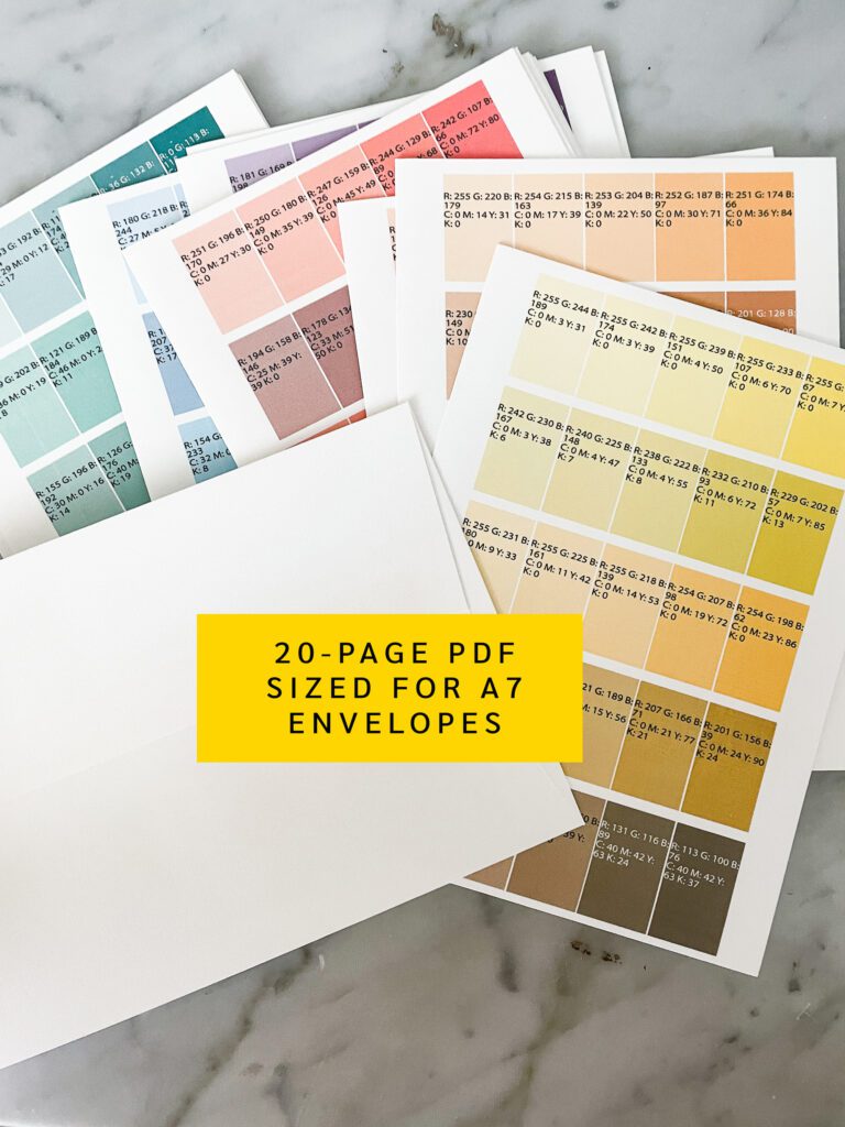
Benefits of the Printable Color Mixing Chart
- Save time. Don’t waste time color correcting a million times for each job.
- Save money. Don’t order sample prints to make sure your colors are good to go.
- Save energy. Stop stressing about how to print gray in CMYK without it turning green or blue or purple.
- Save paper. No more reprints, sample prints, or print adjustments due to color.
Notes about The Printable Palette
The first thing to note is that digital printer results can vary based on weather, stock type, ink levels, and other factors. You are not guaranteed to get the exact same results every single time, but this tool will definitely help you get close.
I also want to note that this tool doesn’t serve as a color mixing tool! Because the printed results will vary by stock and printer used – your results will not match a Pantone Guide, and The Printable Palette should not be used as a replacement for the Pantone Formula Guides.
I like to think of this as a color matching tool, whereas the Pantone Guides are a color mixing tool. With the PMS Guides, you’re guaranteed a color result every time. The point of The Printable Palette is to help you match when color results vary from machine to machine.
Lastly, it should be obvious, but this color chart will not help you with letterpress printing, screen printing, etc. It can help you match digital printing to those other processes, but it’s a tool specifically for digital print color matching.
If a giant, printable color chart PDF sounds like something you could use – grab The Printable Palette today! Match colors with ease by getting your color matching printable palette on!
Printable CMYK Color Chart
Behind the scenes with your favorite Stationery Auntie Laney (and all the inside scoops!)
Not sure where you should start?
I gotchu
Just feeling it out?
Check out our 7 Day Invitation Design Crash Course!
Ready to Start?
Our signature beginner's course From Start to Suite is perfect for you! It's literally *everything* you'll need to get started as a stationer!
Ready to Scale?
Join Stationery School for continuing education with 100+ lessons and new ones released monthly!