Affilate Marketing
All Things Printing
Business Resources
CRMs and Systems
Marketing
Tips & Tricks
Hi, I'm Laney!
I make wedding invitations and I teach artists how to work smarter, make money, and run a business that works for you.
We'd love to have you join us - signup for our email list to get DBL updates, stationery design tricks, business tips and more!
When you’re new to stationery design, you may not have a lot of work to show. You may not have very many clients (or frankly, any clients). So when these educator jerks are telling you to post a photo on Instagram every day (oh hey, that jerk is me!), it can seem a little daunting.
How can you post every day when you’ve only designed 3 different suites? How can you afford to create a new sample suite for every day of the year? Well, you probably can’t afford it. But luckily, you don’t have to – it’s all about thinking more creatively about the suites you have produced, in order to get interesting, unique photos of the entire process and each different part.
And equally important to getting unique photos of different aspects of the suite is getting a unique, new story to tell alongside each photo. You can’t post 13 different photos that all say “Lovely invitations for Katie + Matt”, because people will get bored and think you have nothing to say. I have no stats to back this up besides my own success, but in my opinion, it’s way worse to have repetitive captions than it is to have repetitive photos.
I don’t always do an amazing job of this, but I’ll show you an example of a suite we’ve used over and over again in a way that doesn’t feel repetitive and still gets active engagement on every new post. It doesn’t hurt that it’s one of our favorite suites ever!!!! And if you’d like a little more of this wisdom with specific tips for YOUR company, we’ve still got a couple slots left for our personalized Instagram Audits on Wednesday!

So for our 1st post, I create the artwork for the suite, and I’ll post something about painting – supplies, colors, how it relaxes me, etc. and about how this will be the feminine element for our upcoming suite!
We typically skip showing the design stages, but you could definitely show a sketch of the suite, proofs, or even mockups here. My next move is when pieces start to come in, to show them one at a time – bonus points for pieces that are unique or interesting.
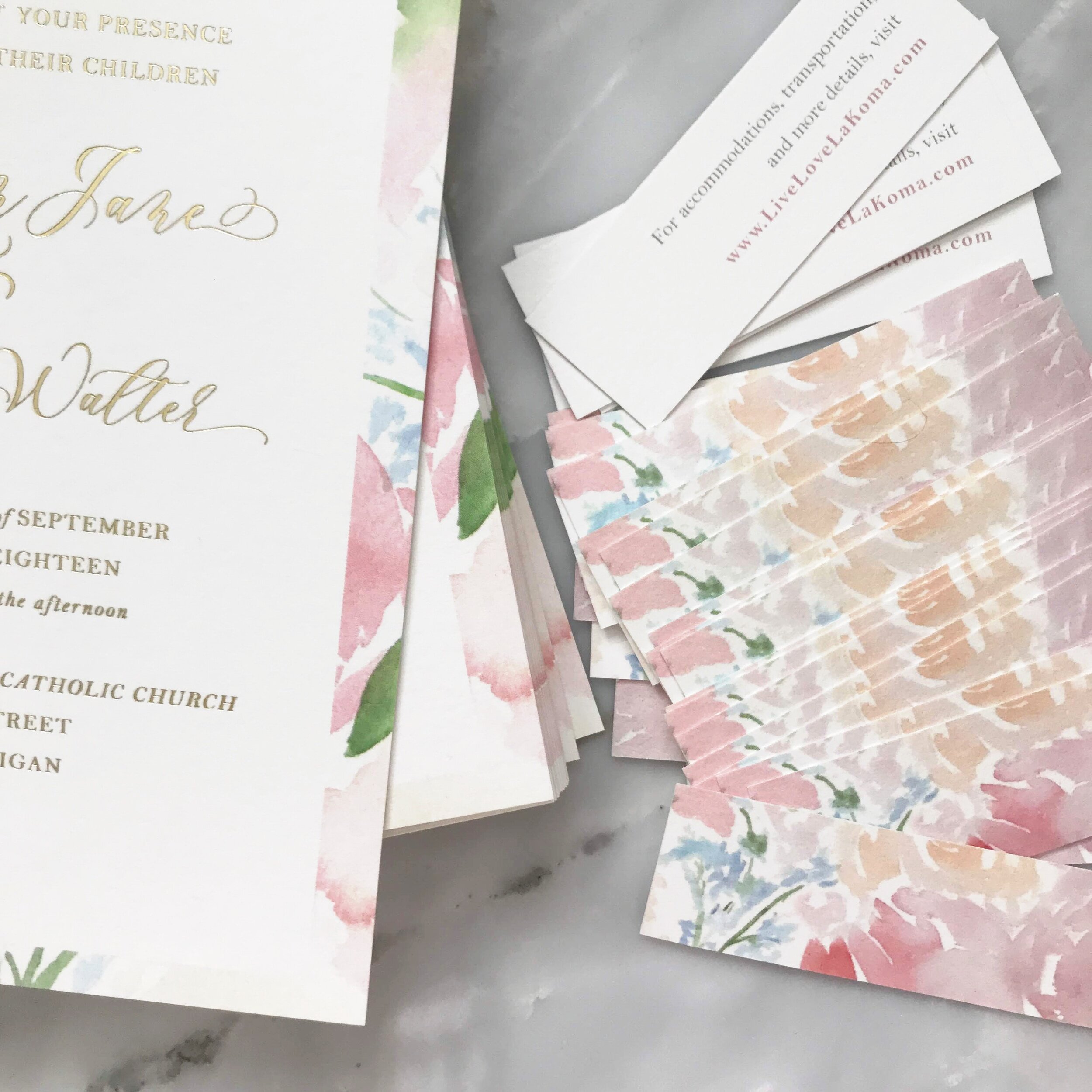
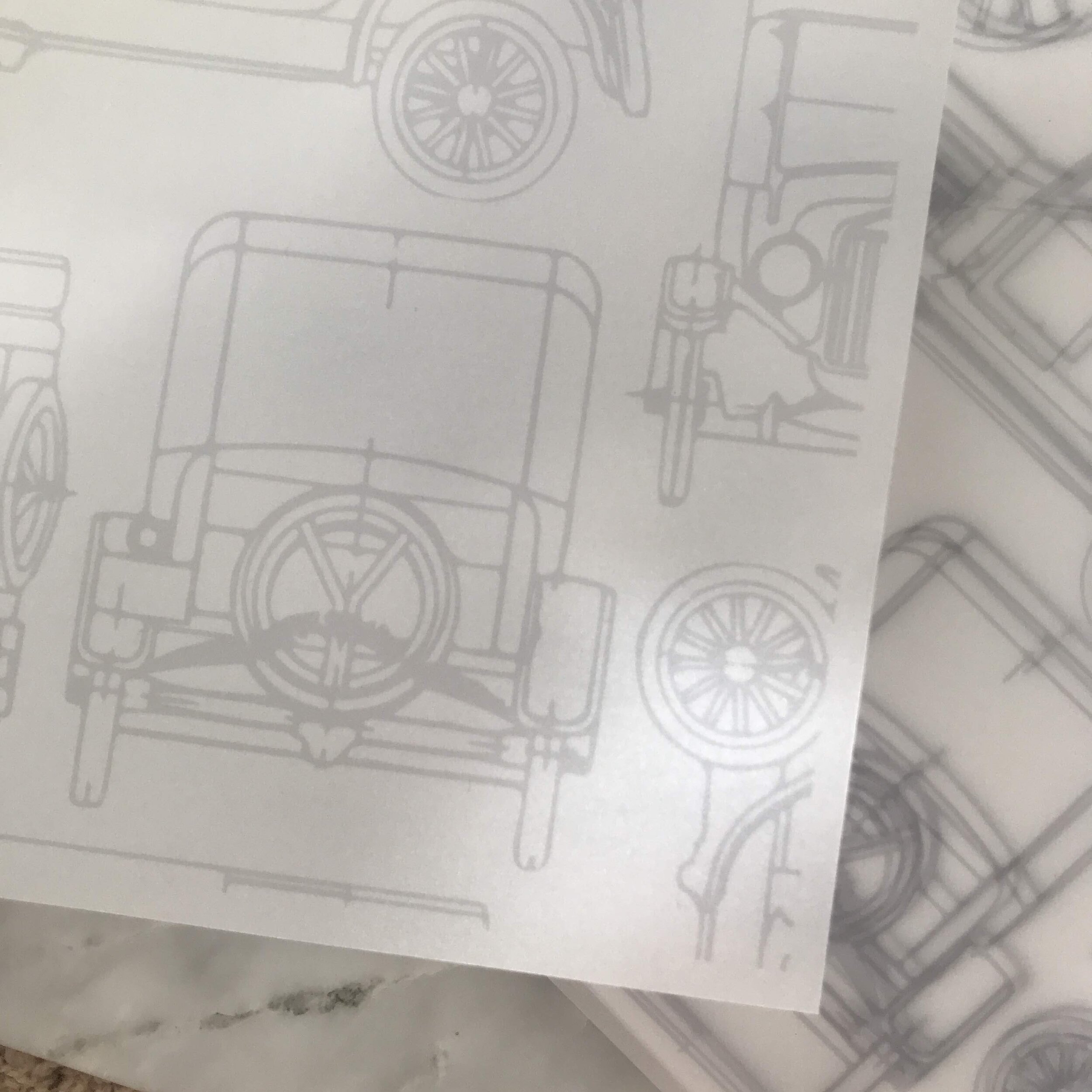
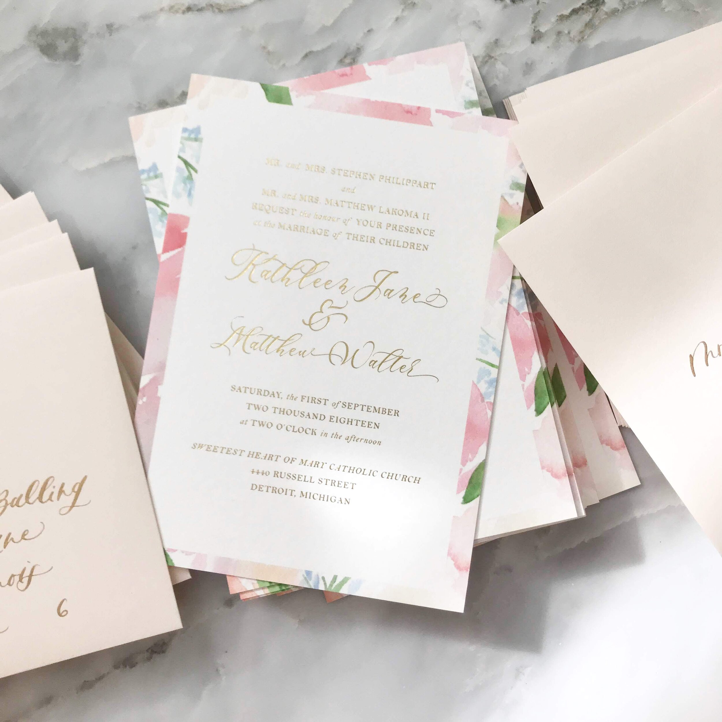
So for our 2nd post, We may talk about this teeny tiny website card and how we’ll be wax sealing it to the invites! Then a photo of this vellum wrap which is the first “masculine” element we’ve brought in, inspired by the couple’s venue, the Henry Ford museum. Fourth, you’ll get the first image of the actual invitation, where we may talk about the gold foil process, or frankly just comment on how nice the light was hitting that day.
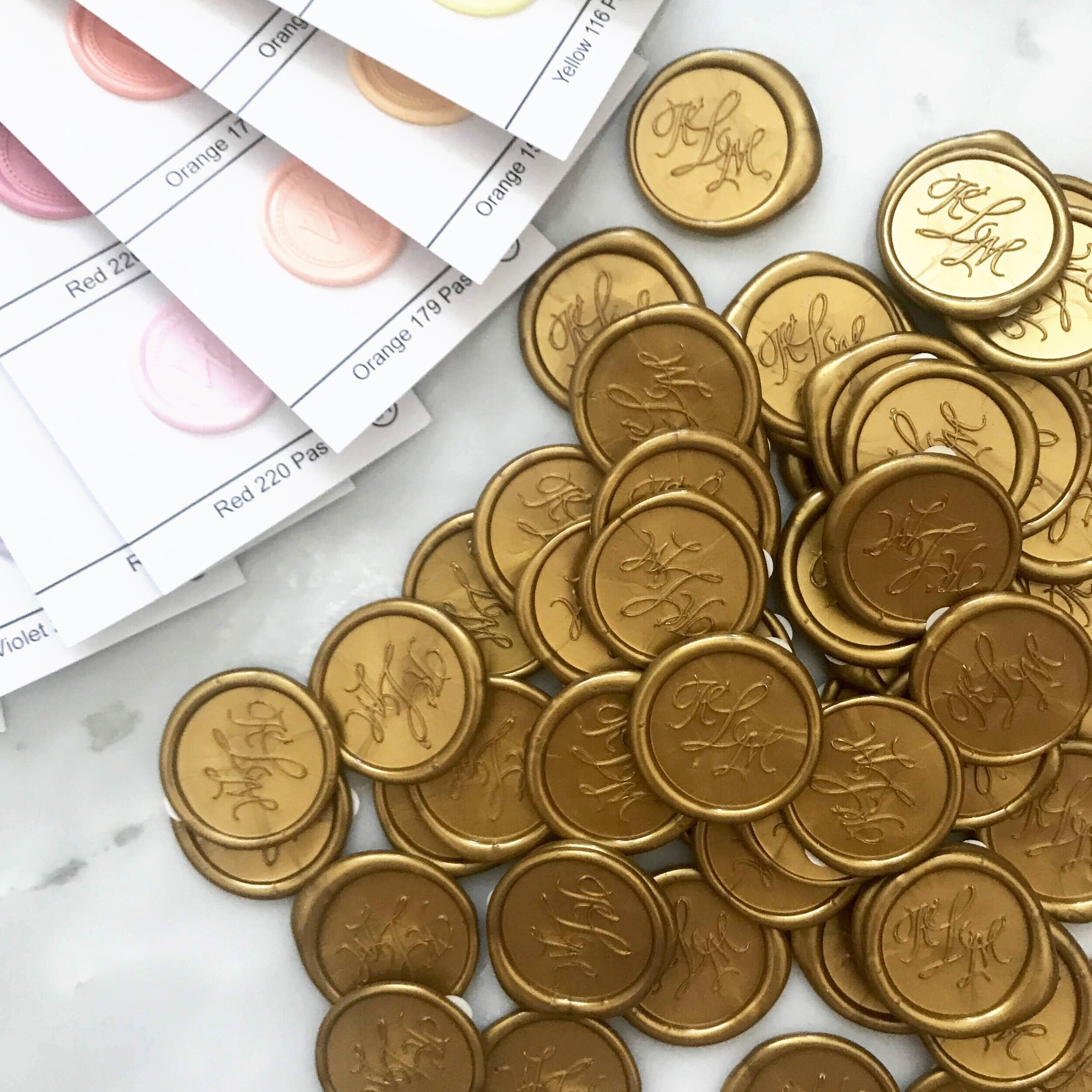
Number 5 will be the wax seals – and lemme tell ya, everyone on Instagram loves a wax seal photo. It’s always a winner (it even made it to our Top 7 Instagram GOLD Stationery Photos).

Photo 6 is this cool one that shows the original artwork side by side with the printed piece. So you can talk about how we get watercolor artwork onto the screen and prepped for larger production.
Now that we’ve shown a lot of the individual pieces, this next one will give a sneak peek of everything together, without showing tooooo much, and after that it’s onto the assembly process.
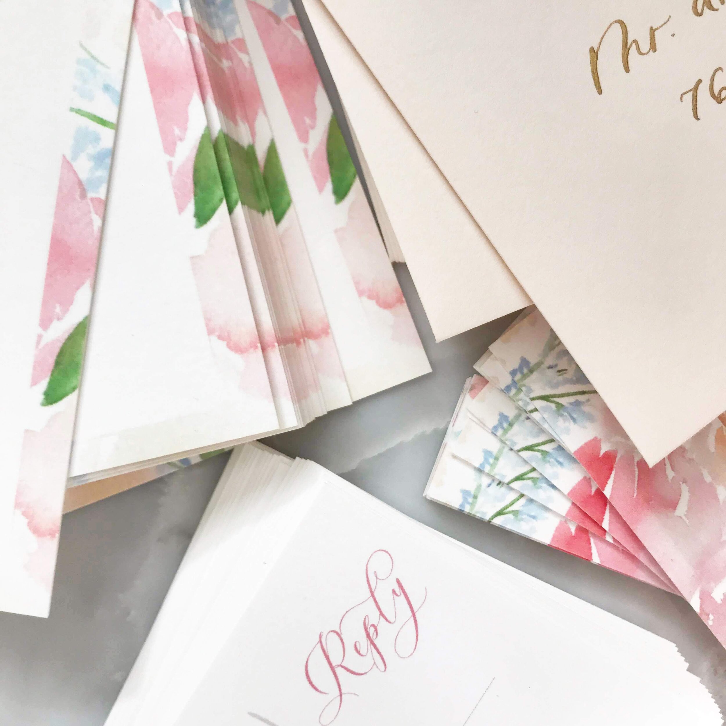

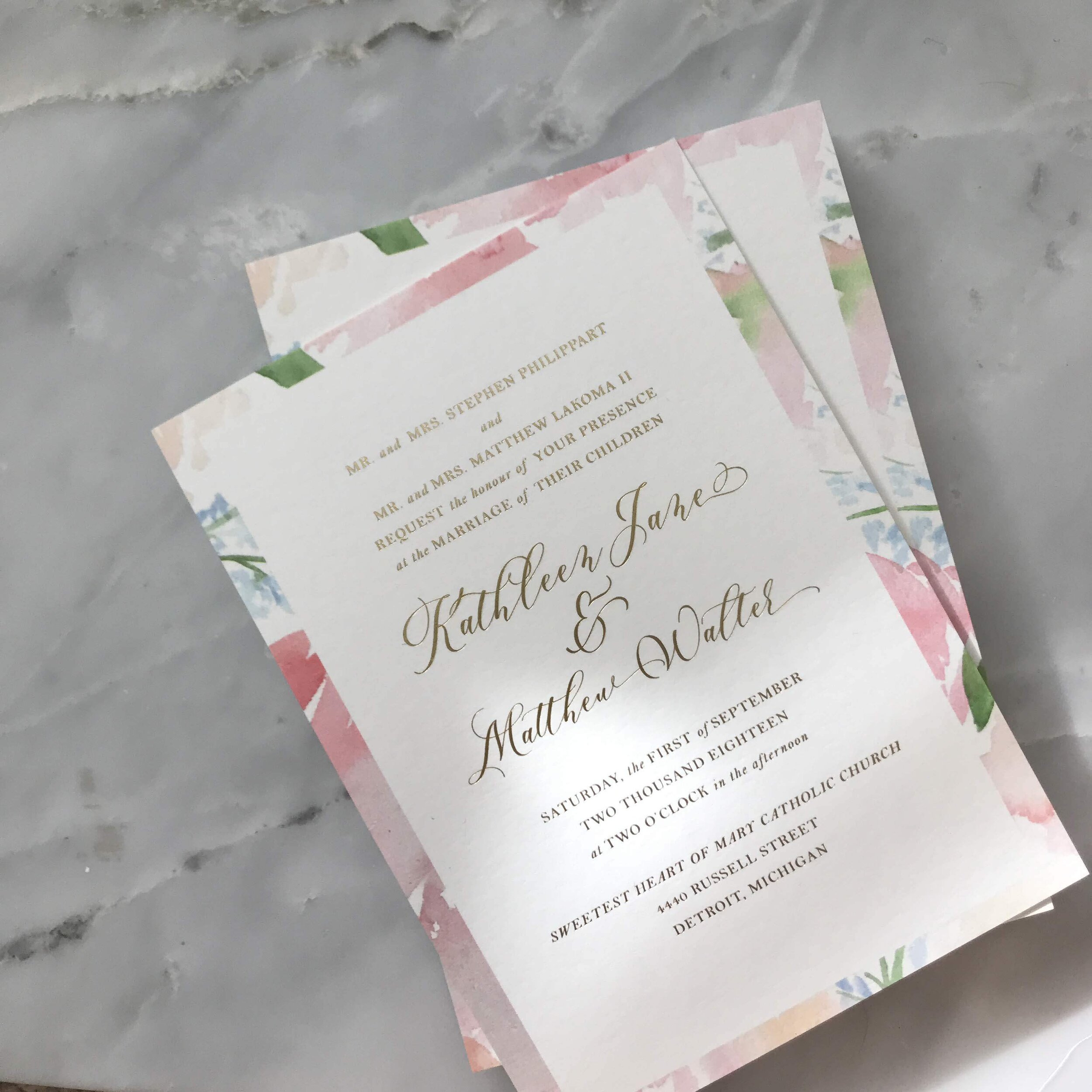
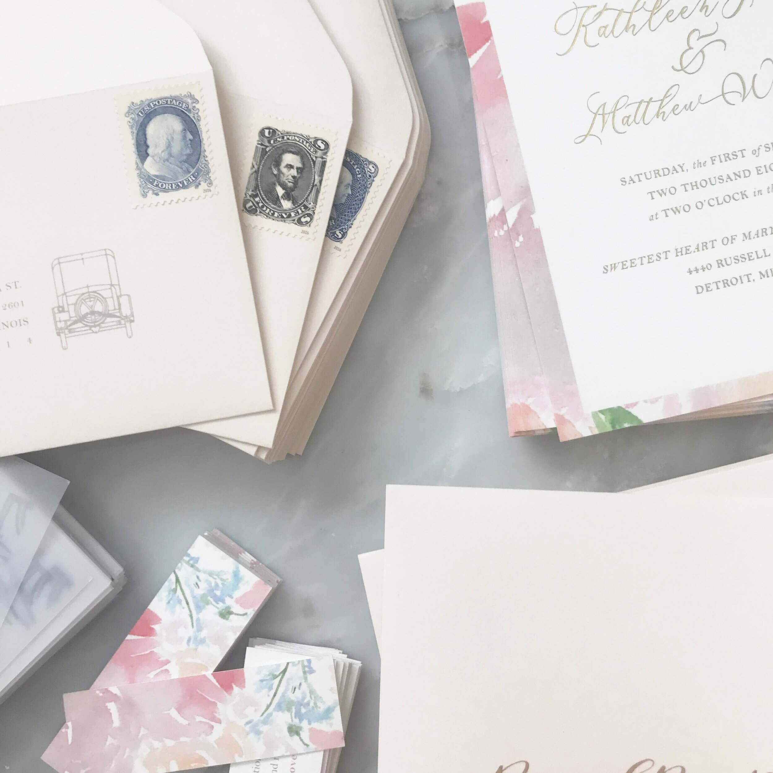
Photo 8 we talk about postage, RSVP envelopes, our favorite stamps, etc.
Number 9 could be simple – something like “Getting these beauties ready to go out the door!”. They don’t all have to be genius captions!!! For photo 10 we could revisit a postage conversation, talk about address printing vs. calligraphy, etc. Or it could even be a spot to talk about the schematic drawings again. Not every follower will see every post, so a little repetition of details is fine – just make sure you’re framing them in a different way!
For our 11th photo, we FINALLY show the entire suite together, and all the pieces involved. You could talk about any aspect you want to here – my first thought is to discuss how you use different elements but still are able to keep the suite consistent overall.

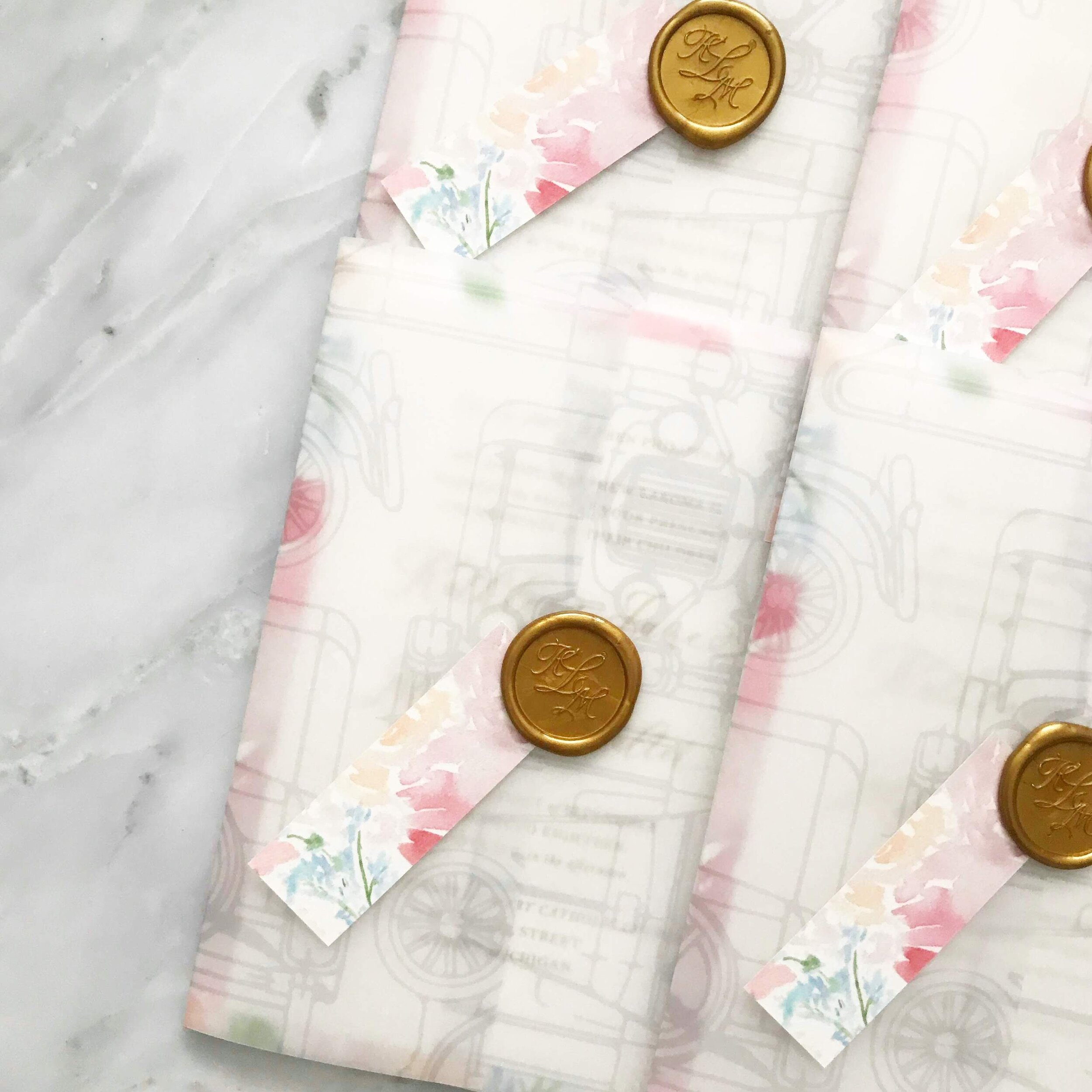
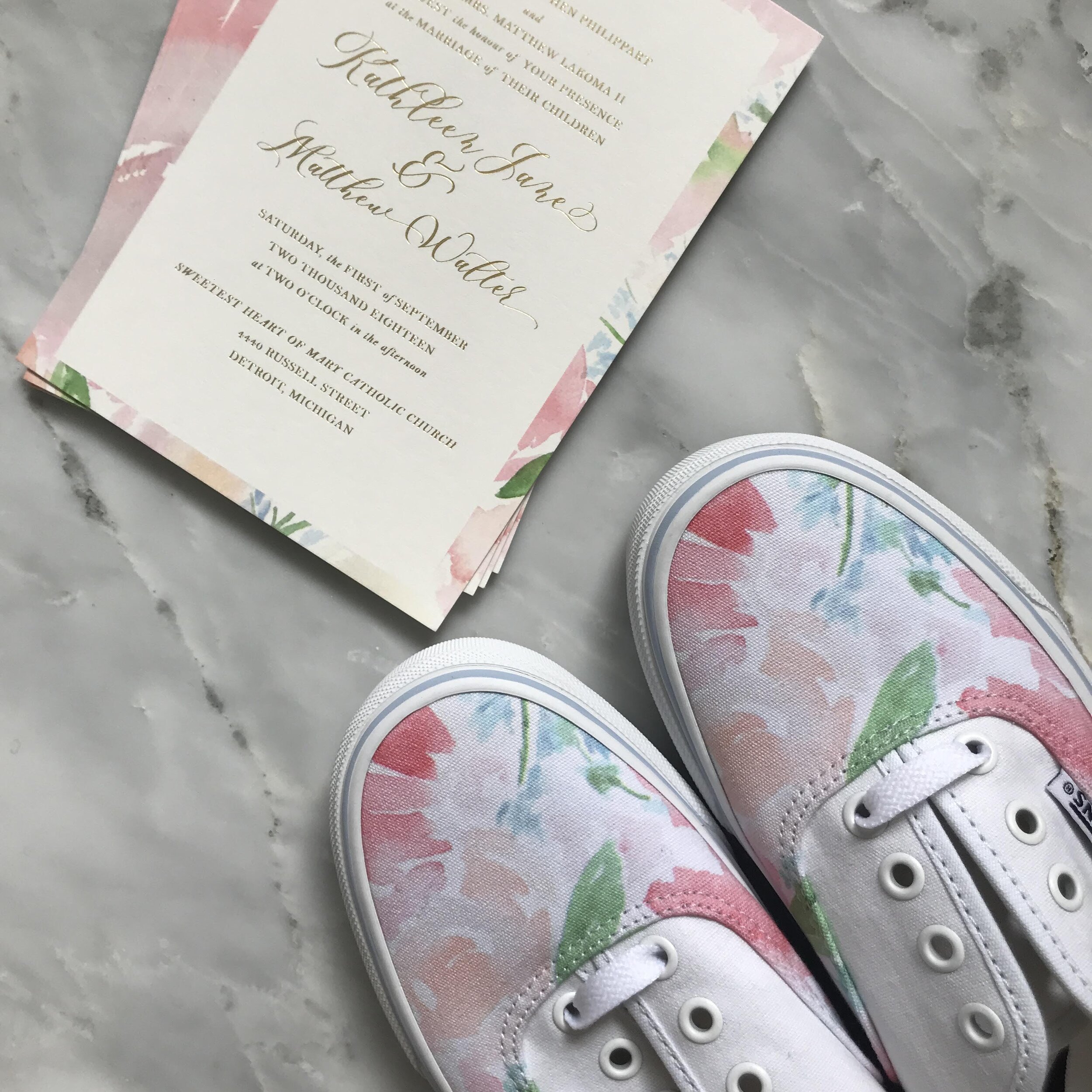
Number 12 of course is how we packaged everything together – we love a good “stack” ya know?! And 13 is kind of a bonus, because we showed the invitation with a pair of custom Vans sneakers we had designed for the bride! Even if that’s not something you do often (we don’t either!), you can always show the invites with some of the wedding day details to exhibit how you keep elements cohesive throughout the wedding day too – plus, if you have wedding day stationery, you can add on another 13 or so photos showing all of those elements!
Obviously, we don’t do this quite as well with every suite, but the point is to get your mind thinking a little more creatively about all the details you put together, why and how you did that, and to highlight them in unique ways to get more content out of every project you have. Someone who does this extremely well is Victoria from Design House of Moira – her feed is basically a ton of different photos of one suite at a time, and not only is it beautiful but it doesn’t feel repetitive at all!
So if you’re just starting out and you’re scared of the amount of content needed to grow your audience, the truth is that it doesn’t really take a ton of work, it just takes a little creative thinking! If all of this sounds a little tiring, it’s because it does take work – but I promise you this is a lot less work than creating 13 entirely different suites and styling them all for photographs.
If you’re interested in saving yourself even more time – you can even task batch all of this and schedule your Instagram posts with Tailwind (yeah, maybe you thought they just do Pinterest, but that’s not true!). If you click on our link you’ll get 31 scheduled photos for free to try it out!
How We Got 13 Different Photos Out of the Same Suite
Behind the scenes with your favorite Stationery Auntie Laney (and all the inside scoops!)
Not sure where you should start?
I gotchu
Just feeling it out?
Check out our 7 Day Invitation Design Crash Course!
Ready to Start?
Our signature beginner's course From Start to Suite is perfect for you! It's literally *everything* you'll need to get started as a stationer!
Ready to Scale?
Join Stationery School for continuing education with 100+ lessons and new ones released monthly!
So helpful- thank you!!
As usual, great content as ideas! Thank you continually sharing with us that are up and coming!