Affilate Marketing
All Things Printing
Business Resources
CRMs and Systems
Marketing
Tips & Tricks
Hi, I'm Laney!
I make wedding invitations and I teach artists how to work smarter, make money, and run a business that works for you.
We'd love to have you join us - signup for our email list to get DBL updates, stationery design tricks, business tips and more!
If you’re thinking about becoming a wedding invitation designer, you’ll need to learn which programs to use for stationery design! I focus primarily on wedding invitation design, but all stationery designers tend to use the same design programs. This post will cover:
- The best stationery design programs
- Which programs to use for what
- Raster vs. Vector design programs
- Free and paid stationery design programs
- Which software is best for printing stationery
First thing’s first: Which are the best stationery design programs?
My favorite software to use is the Adobe Creative Cloud. This is a subscription service which you can typically get for about $30-50/month, depending on your promotion, and it includes access to all of Adobe’s programs. The main programs we’ll focus on for stationery design are:
- Adobe Illustrator
- Adobe InDesign
- Adobe Photoshop
These three are the most commonly used programs for wedding invitation design, but there are other programs included in the Creative Cloud that you can use for all sorts of things – video editing, photo editing, sound editing, etc.
Do I need Adobe Creative Cloud to be a Stationery Designer?
The short answer is: No, you don’t need to use Adobe to design wedding invitations or stationery. I’ll cover some alternatives further down. But Adobe is the industry standard for graphic design, and that comes with some benefits. Namely:
- Adobe tutorials are really easy to find online
- Other stationery designers will be using Adobe
- Your print shops will be using Adobe
- Most stationery design courses are taught using Adobe
- It’s extremely robust (more so than most other options)
So while it’s not the only option, it is the option that most people will be able to help you learn with. And if you ever get into a pickle, or have something off with one of your files, your fellow designers and printers will be able to give you advice in Adobe most likely. If you use Canva or Procreate to design wedding invitations, then you’ll probably have trouble getting advice when something isn’t working how you want it to. Plus, if you take any Invitation Design Courses (like ours!) they will likely be taught using Adobe programs.
You shouldn’t only want to use Adobe Creative Cloud because…everyone else is doing it. It’s also a very robust design toolkit, and in general you’ll really enjoy all of the features Adobe programs have to offer. There is a reason these are industry standard, after all.
Adobe Programs for Stationery Design
Which Adobe programs are best for stationery design? I mentioned my favorite three above: Illustrator, InDesign, and Photoshop. Most invitation designers prefer Illustrator or InDesign as their main design program, and they have very similar capabilities. I’ve heard that most classically-educated designers prefer InDesign, whereas a lot of self-taught designers like myself (and likely you, if you’re reading this!) prefer Illustrator.
The key to understanding which program you’ll like best is to understand their differences, and what each was designed to do. But first, you need to understand the difference between raster and vector graphics.
Raster vs. Vector Graphics
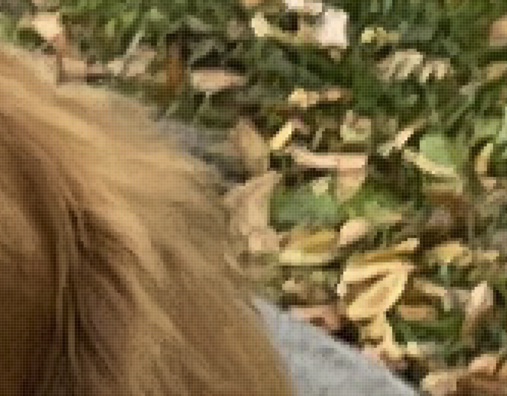
When it comes to graphic design, there are two main types of graphics you’ll be working with: raster and vector. Raster graphics are made up of pixels, and are what you probably think of as a traditional image. Basically, a raster image is a grid of pixels, and if you zoom in far enough, you can see those pixels. The image will start to look blocky, like this.

Raster images can handle shifts in colors really well, like in a photograph or painting. This is because each pixel can be a different color, and there are typically a lot of pixels. So the subtle blending in a watercolor painting can be handled easily by pixels that fade from one color to another.
The main issue with raster graphics is that there’s only so many pixels, and you can’t really make up pixels that don’t exist. If you paint something and scan it in, you generally can’t blow it up really large without seeing the pixels. AI is helping with this, but you simply cannot make new real pixels in an image where there are none. Thus, raster images are better with color variations, but limited in size. Typically, if I want to print something at 5×7”, for instance, I have to paint it at 5×7” or larger.
What are Vector Graphics?
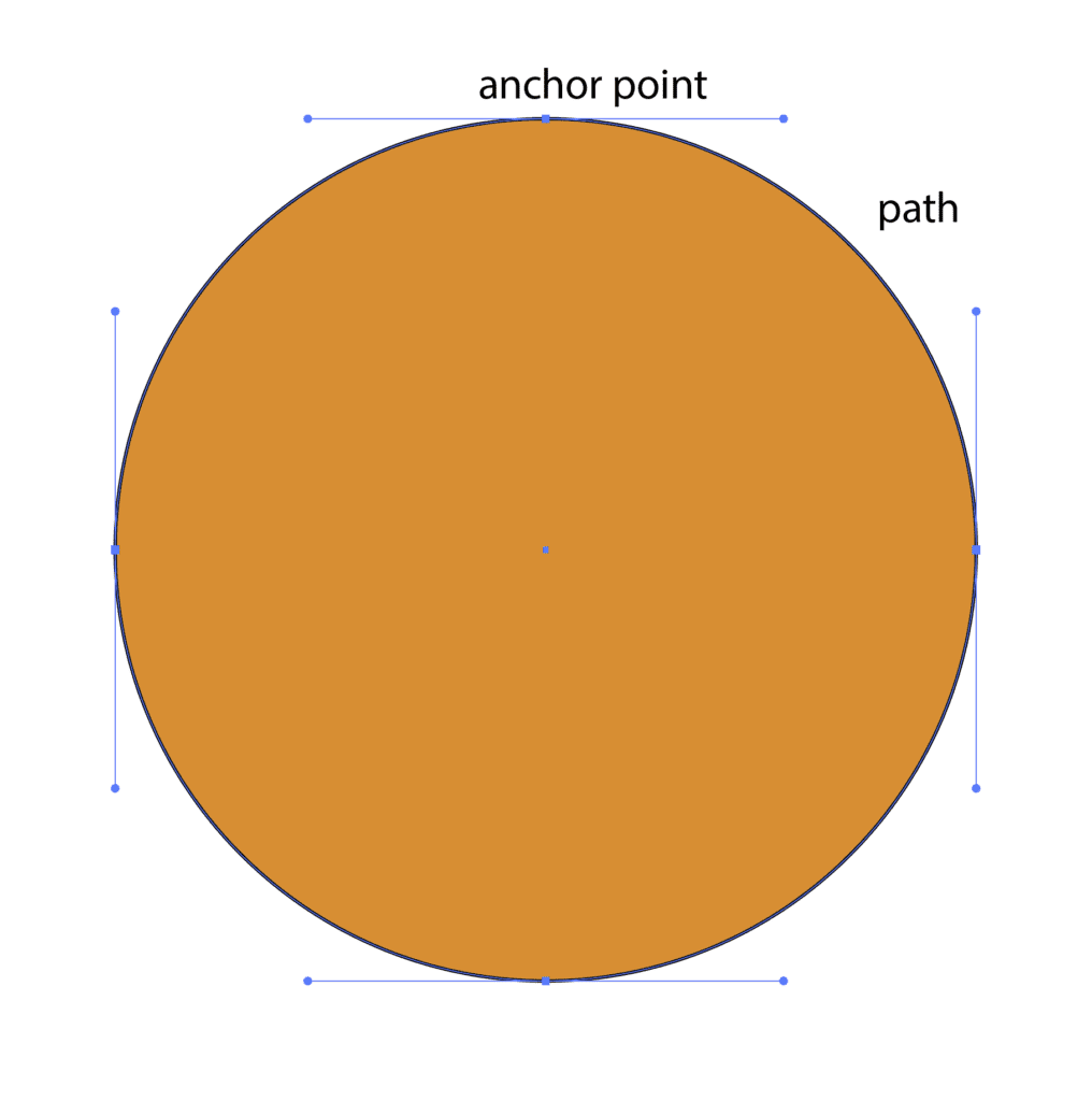
On the flip side, you have vector graphics. These are graphics created by math! You’ll basically place a point in space, and another point in relation to that first point. These are called anchor points. Then a “path” will be formed between those two points using math. Here’s an example using a circle – you can see the 4 anchor points, and the path formed between them. This particular path is closed, meaning it ends back at the first point, and the filled in path forms the circle.

You can change the angle and extremity of the path (this is the “vector” part), but once it’s set – it will always be the same. So no matter if those points are 1” apart or 1 mile apart, the same angle will determine the path between them. That’s why you can blow up the same circle, with the same 4 anchor points, as much as you want and it will still look like a circle.
Basically, raster graphics are made of a limited number of squares in a grid. Vector graphics are made by points connected by a path. You can’t really add squares to the grid in raster images, but you can change the size of your vector graphics as much as you want without affecting the overall shape of that path.
Vector graphics are great for things that need to be very large or very small in size, things that need to vary a lot in size, things that need to be used in lots of different ways (like logos), or anything that’s going to be cut out (the cutting machines follow the path!). They’re also great for things that need to be limited in color, such as a screen-printed shirt, or a letterpress printed wedding invitation. Fonts are always vector, which is why you can always increase or decrease the size with ease.
So now you know the difference between raster and vector graphics, you can understand the different Adobe Creative Cloud programs!
Adobe Photoshop for Invitation Design
Adobe Photoshop is a raster editing program. Its core unit is the pixel! For this reason, you’ve likely heard of it for photo editing. It’s also commonly used for digitizing and editing elements like watercolor paintings.
In the context of stationery, Photoshop is not the best program to actually design in. It’s a great program for editing your raster elements (photos, watercolors, drawings, etc.). Photoshop is not great for layout and text, however. It’s also not ideal if you have lots of pieces in one project to work on, as your files are generally limited to one canvas. Therefore, you’d need to work on the invitation, reply card, envelopes, etc. all in different files.
What most invitation designers do is use Photoshop for raster element editing, and then pull those elements into either Illustrator or InDesign to actually design the individual pieces of stationery. Everyone has their favorite stationery design program – mine is Adobe Illustrator.
Adobe Illustrator for Invitation Design
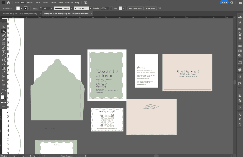
Unlike Photoshop, Adobe Illustrator is a vector graphics program. It’s best for creating and handling vector graphics, which includes text. I love Adobe Illustrator for invitation design, because it can handle text really well. I also love that you can use a bunch of different artboards in the same file. Artboards you can think of as different pages or pieces of a design. For instance, the invitation gets its own artboard, the RSVP card gets its own artboard, the envelopes get their own, etc. With all the different artboards, I can see the entire invitation suite design at once. The artboards are the white backgrounds shown in the photo below!

Adobe Illustrator is also really excellent for things like gradients and graphic elements. It works well for layout and text editing, too. For these reasons, it’s a good program for wedding invitation design.
While Adobe Illustrator is mainly a vector graphics program, that doesn’t mean you can’t use raster graphics as well. All of the Adobe programs tend to talk to each other very well, so you can pull in raster elements and lay them out in conjunction with your vector graphics and text. You can do that similarly in Adobe InDesign.
Using Adobe InDesign for Stationery Design
Adobe InDesign is also a vector-based program, but it wasn’t designed to create vector graphics the way Adobe Illustrator was. InDesign was created to be a layout program, and is at its core best for laying out publications. Usually long publications. Things like magazines, pamphlets, books, etc. are best created in InDesign.
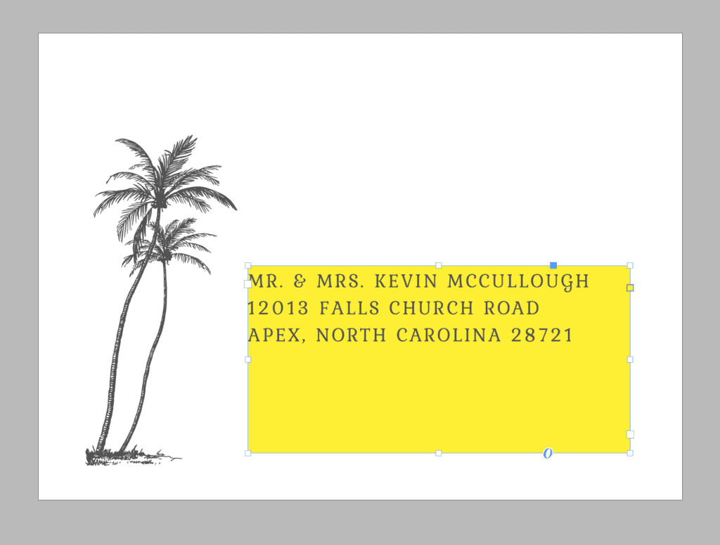
Whereas the core unit in Adobe Illustrator is the vector path of an element, the core unit in InDesign is the frame. You can place frames on different pages, and then place different things in them – images, text, graphics, etc. You can edit the frames and what is inside them separately. In this image, you can see I’ve changed the color of the text frame, without changing the color of the text itself.

InDesign handles both vector and raster graphics very well, like Illustrator. So you can edit your raster elements in Photoshop, and then bring them into InDesign for layout.
Neither InDesign nor Illustrator was specifically made for invitation design, but either works really well. Most designers simply prefer one over the other. You can get the same results with both in most cases.
InDesign’s Strengths for Stationery Design
One of the best use cases for InDesign is when a project needs lots of pages that have some similar and some unique elements. If you need to print 100 of the same exact thing, you can design it equally well in Illustrator or InDesign. But for things like address printing, table numbers, or place cards, you might find that you need some things to stay the same (font, design elements, colors, etc.) and some things to change (the address, the table number, or the person’s name). This is where InDesign really shines!
This video will show you how to create a data merge in InDesign, which is commonly used for addressing and escort cards. You can also use Parent Pages for something similar – here’s a video on that tool as well.
Even those designers who prefer Illustrator, like me, typically use InDesign for documents like this!
Which Adobe Software is Best for Stationery Design?
Overall, all 3 of these softwares work together for a complete stationery design toolkit. I typically start with Photoshop, to edit any raster elements in the design, and then move everything into Illustrator. Then I’ll use InDesign when printing addresses for the client. Some designers prefer to use InDesign over Illustrator for their designs. I’d encourage you to try both of them and see which interface feels better for you!
The best part about using these programs together is that they connect on some levels. So if you have already brought an image into Adobe Illustrator for a design, and then you decide to change it in Photoshop, it’ll automatically update that image in Adobe Illustrator. You can also share color swatches, templates, fonts, and other elements between programs. This makes working between programs really easy!
Another wonderful thing about using Adobe Creative Cloud programs for stationery is that there are all kinds of tutorials and courses out there on how to use them. I have one course that will help you start a stationery business and learn how to design using Adobe programs as well. I also offer some free tutorials on specific Adobe features on my YouTube channel.
The biggest downside about Adobe Creative Cloud is that it costs money. So if you want to look into other programs for stationery design, here are a few that other people like!
Using Canva for Stationery Design
Canva is a free, cloud-based design program (with a paid option for upgraded features). Your designs will stay in your account, and you don’t have to download them onto your computer ever, which is nice. You do have to connect to the internet to work on your designs, though.
Canva is user-friendly and contains a lot of robust features, including some design elements that you can use in your designs, a number of beautiful templates, and a library to upload your own custom elements. You can also share access to your designs with team members really easily.
If you want to design wedding invitations on Canva, your biggest concern will be printing. It’s a little more difficult to print high quality designs from Canva, as you have less control over download specs, color handling, and file types. You also cannot download vectors from Canva, so if your printers require a vector file for something (often required for letterpress and foil printing) you will need to vectorize those files in a different program. Many of the robust features in Canva that you’ll want as an invitation designer (uploading your own fonts, for instance!) only come with the (paid) Canva Pro Membership.
Using Procreate for Invitation Design
Procreate is a wonderful app, mainly for iPads, that allows you to draw and type and design right on your iPad. A lot of designers who started as illustrators like to use Procreate, because they’re already familiar with it. Personally, I use Procreate for a lot of things in my business, but not for actually designing wedding invitations.
While it’s possible to design wedding invitations in Procreate, you’ll quickly find limits to the app. If your designs are heavily illustration-based, you can complete those illustrations in Procreate, and then use a different program for layout and printing.
Like Canva, Procreate doesn’t give you a lot of options when it comes to exporting and printing documents. You can’t work with a lot of different files open at once, if your invitation suite has multiple pieces. It also doesn’t export vector files directly; in fact, Procreate works solely in raster, not vector. And you’ll find that working with a stylus or touchscreen only, instead of a mouse, only goes so far when you’re designing wedding invitations full time. Not to mention, there are numerous features that Procreate doesn’t offer, which might not be so obvious as a beginner, but will slow you down as you progress in your design career.
The main draw to Canva and Procreate vs. Adobe programs will likely be the price, and maybe the user-friendly nature of these programs compared to the more daunting task of learning Adobe programs. However, if you’re serious about starting a stationery design business, then you want to invest in tools that you won’t quickly outgrow. A lot of designers have started in Canva or Procreate, so if that’s what you need right now, go for it. But don’t be surprised when you eventually get convinced to learn Adobe anyway! I warned you 😉
Using Affinity Designer for Stationery Design
Affinity Designer is the only option on this list that is a reasonable substitute feature-wise for Adobe Illustrator. It also can be a good deal cheaper, as it’s not adapted to the monthly subscription payment model yet, and can be purchased for a one-time cost (varies, depending on what option, but around $160 at this time).
Affinity contains many similar features to Illustrator, and is almost as robust as Illustrator for designing invitations. There are a few areas of difference though.
In general, you will likely find Affinity to be a little easier to learn and pick up on your own, as its interface can be more user-friendly. However, the plethora of Illustrator tutorials out there makes this point a little irrelevant. If you’re planning to take any stationery design courses, they are likely taught in Illustrator, so you’d be more on your own for learning Affinity.
Illustrator contains an Image Trace tool that helps convert raster images into vector, which is extremely useful in invitation design. It also has more text-editing features than Affinity, and seeing the large role text plays in invitation design – this is a big deal. Illustrator also integrates with Adobe Fonts, a free database of fonts you can use for your designs in all Adobe programs.
On the other hand, Affinity can be better for working with raster images. It has some of the features of Photoshop for image editing, which can simplify your process a bit. Affinity is also known to be better with 3D images, if that’s important to you. And of course…it’s a lot cheaper over time.
Overall, the only true competitor on this list to Adobe is Affinity Designer. Some people just prefer Affinity’s interface, and most people love that it’s a cost savings! I honestly believe that learning Adobe will provide a better long-term payout, but hey – try them both out and see what you like!
There’s no “right way” to design wedding invitations, as long as you’re providing a good product to your clients. I truly enjoy finding new and different (and hopefully more efficient) ways to do things in Adobe programs every day! For more stationery design tutorials, please check out our YouTube channel, and if you’d like to start your own stationery business – here’s our foundational course that will give you everything you need to know to get started.
Stationery Design Programs
Behind the scenes with your favorite Stationery Auntie Laney (and all the inside scoops!)
Not sure where you should start?
I gotchu
Just feeling it out?
Check out our 7 Day Invitation Design Crash Course!
Ready to Start?
Our signature beginner's course From Start to Suite is perfect for you! It's literally *everything* you'll need to get started as a stationer!
Ready to Scale?
Join Stationery School for continuing education with 100+ lessons and new ones released monthly!