
If you’re planning on printing wedding invitations, whether your own or for a client, you might be surprised at how tricky it can be! It’s definitely not as simple as just clicking “print” on a random office document. You want to get your colors printed correctly, make sure you’re using good paper, and have your artwork print in high quality. If you’re struggling with printing wedding invitations – you’re in the right place.
I’ll walk you through issues like:
- Colors printing differently than on screen
- RGB vs. CMYK color printing
- Images and artwork not printing well
- Best types of printers for printing invitations
- Text not printing well
- Borders printing off-center
- Flood printing
- Printing on colored paper
A lot of printing mistakes, it turns out, are design mistakes! If you design with the right expectations, printing won’t be as challenging. Let’s talk about how to avoid these invitation printing issues.
Colors Printing Differently on Paper
This is the most common invitation printing issue! Colors are hard to print sometimes. If you need an EXACT color match, then I would recommend going with Letterpress Printing instead of Flat/Digital Printing. Your inks can be mixed to match an exact Pantone formula, and you’ll get the same result no matter who mixes your ink.
When flat or digital printing, however, you don’t have as much control over the ink. Every printer will print the same colors differently. Some print shops will match flat printing colors to Pantone formulas, but most won’t, and that doesn’t work if you’re printing in-house.
My best advice for printing colors accurately:
- Calibrate your monitor! This is the best thing you can do for accurate color results.
- Use colors that are easier to print (ie: black instead of a purpley-greyish-blue)
- Understand CMYK and RGB differences (next section!)
- Print out sample swatches and adjust colors accordingly (I made a PDF Printable Palette with over 2,000 colors to help with this!)
- Work with a print shop that does Pantone color matching
- Use Letterpress printing if you need the *perfect* match
RGB vs. CMYK Colors for Printing
Short answer: Use CMYK colors for printing. Always.
Longer answer: RGB (red, green, blue) color space is designed to have light shining behind it, from a screen. This is the perfect color space to use for digital graphics. Anything on your website, social media, Etsy, etc. should be designed in RGB.
On the other hand, CMYK (cyan, magenta, yellow, black) colors are used for printing. If you’ve ever replaced printer cartridges, you’ve likely seen that they split them into C, M, Y, and K! When you print colors, there’s no light shining behind them. In fact, paper absorbs a lot of light, and what you see is what is left over. So this is the type of color mixing you need to work with when you’re printing something on paper.
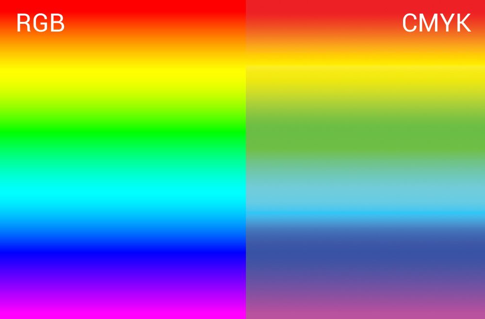
You can see in this image that the RGB spectrum contains some brighter colors than the CMYK spectrum. Keep that in mind while you’re designing. Specifically, really bright colors like neons will not print as brightly in CMYK as they appear on your screen.
Images and artwork not printing well
If your images are printing blurry, there are often 2 reasons: your resolution, or your paper.
Let’s start with image resolution. You want your images to be at least 300ppi (pixels per inch) or higher. However, keep in mind that they need to be at least 300ppi at the size you intend to print them. Sometimes a photo is 300ppi at 3×5” but if you blow it up to 5×7” it will have around half as many pixels per inch, thus making it print blurry. Make sure your image is 300ppi or higher at the size you intend to print it.
If you’re working with vector graphics, you shouldn’t have any resolution issues! Some info about vector vs. raster graphics in this video tutorial.
Secondly, you might see blurry images because of your invitation paper. Smooth paper is the best invitation paper for quality photo printing – however a lot of invitation papers have more texture. Eggshell papers or cotton papers can feel more luxurious, but you’ll see some texture in your images. I personally don’t mind, but if your priority is the image clarify – go with smooth paper.
Learn more about Invitation Papers:
Best Printers for Printing Invitations
The best printer for your wedding invites will depend on exactly what you want to achieve and what materials you’re using. Personally, as a professional stationery designer, I outsource as much printing as possible to my favorite print shops (I’ll link 3 of my favorites below!). This allows me to focus on design.
But if you want to print in-house, or are just printing your own wedding invites, then there are a few good options.
Most likely, you’ll want to start with an Inkjet Printer. They can print images and artwork with lots of colors well, work on handmade paper and vellum (make sure you get inkjet vellum – this is my favorite brand), and can handle thicker papers. You can also print envelopes open flap on an inkjet printer, meaning you can print return address and guest address at the same time if you set it up properly. Laser printers, on the other hand, print more quickly, handle text a little more crisply, and work on metallic or really smooth papers (and laser vellum).
Small envelopes, for your RSVP cards, are typically harder to print. You might want to try printing address labels instead of printing on those envelopes!
A few good printers for wedding invitations are:
Where to get Wedding Invites Printed
If you’d like to outsource, I’ll share my favorite print shops below!
For personal print jobs, my favorite print shop is Prints of Love. They include free white envelopes with every invitation order, and do really good work in a couple of days. If you want to upgrade to color envelopes, I really like this vendor on Amazon!
Another wonderful option is StationeryHQ. They offer all sorts of invitation printing, and day-of items like signage, guest books, etc. !
If you want to get into this business, then my favorite go-to wholesale printer is PrintsWell. If you use my link, you’ll get $25 off your first order. I love working with them because they have great invitation paper options, quality printing, and a wonderful online ordering system that makes it easy!
Text not printing well
If your text isn’t printing well, you may need to do 2 things. If your text is really thin, it might not print very crisply. What you can do is either print a bold version, or “add a stroke” (exactly how to do this will depend on what program you’re designing in – but that’s the function you want to look up!).
If you’re getting weird characters or anything, then you might need to “outline your text”. Often, saving your design as a PDF will accomplish this, but again, it’ll depend on what program you’re using. Outlining your text means that you basically imprint the text into the design so it’s no longer an editable font. You will not be able to change the text afterward, so make sure you save a version with text NOT outlined in case you need to make changes later.
Borders printing off-center
Borders are kind of tough to print with flat printing! The main reason is that flat printed invitations are usually printed on a larger piece of paper and cut down to the final size. If there is any shift in the cutting (even 1/16”), then a border can look off-center!
Use thicker borders to combat this issue, and move them further from the edge of the page! A wavy, scalloped, or squiggly border will often hide a slight shift better than a solid rectangle border.
Flood Printing on Wedding Invitations

Flood printing is when you print a solid color onto a piece of paper – instead of printing on green paper, for instance, you can flood print a green background and have the white of the paper show through for the text. This is cheaper than printing on colored paper, however it’s hard to do well!
PrintsWell, my favorite printer that I talked about earlier, does a really good job (see the photo to the left – none of these are printed on colored paper!!!). However, most in-house printers will leave your paper looking heavy and streaky if you try to flood print. If you’re attempting a large solid block of color – outsourcing will be your best friend.
Printing Invitations on Colored Paper

So if flood printing isn’t ideal – can you just print your invitations on colored paper? Sure you can! However, I’d recommend only printing on really light colored papers. You’ll need a special white ink printer or something to print light colors on darker paper.
If you decide to print on light paper (here’s a great place to order it!), just pay attention to how the paper color will affect your ink colors. For instance, printing blue on pink paper will turn your blue a little more purple! Here’s an example of the same shades printed on several different colored envelopes.
Printing your wedding invitation designs can be a tough skill to master (that’s why professional stationers like me exist!). If you follow these tips, you’ll get much better results!


Behind the scenes with your favorite Stationery Auntie Laney (and all the inside scoops!)

