Affilate Marketing
All Things Printing
Business Resources
CRMs and Systems
Marketing
Tips & Tricks
Hi, I'm Laney!
I make wedding invitations and I teach artists how to work smarter, make money, and run a business that works for you.
We'd love to have you join us - signup for our email list to get DBL updates, stationery design tricks, business tips and more!
As a graphic designer, I’m always searching out the best CMYK colors for printing. It’s sometimes tough to get the same colors on your final products as you have on your screen. I make wedding invitations, so my clients want to be able to approve their invitation design proofs and know that the invitation printing is going to come out accurately. So how do I make sure the CMYK colors print well? Today, I’ll share my tips for the best CMYK colors for printing!
What are CMYK colors?
First, what are CMYK colors? CMYK refers to the four colors that are used in most printing processes – cyan, magenta, yellow and k (black). There are actually 2 different types of color mixing – additive and subtractive, and CMYK is subtractive. This means that the colors actually absorb light and show us what’s leftover!
For instance, if you put a green dot of paint on paper, that green paint’s job is to absorb all the other colors on the white paper except green. That will leave us seeing only green. We use CMYK colors for printing on paper, because the paper has colors reflecting back to us already. We need use subtractive color mixing to subtract the spectrum of colors that we don’t want.
If you mix all the subtractive colors together – you get black. Think of this like mixing all the colors of paint together – you’d get a black or dark brown mess.
What are RGB colors?
RGB colors refer to red-green-blue, which are the “additive colors”. These colors reflect light out to us to form what colors we see. We use RGB colors for anything on a screen, because the light of the screen shows us the colors. The screen itself doesn’t absorb anything like the paper does.
So if you add all the colors together on a screen, you’ll actually get white with ALL colors being projected out to us. This is the opposite of what happens with subtractive colors. If you mix them all together you’re effectively absorbing all the colors and you’ll end up with black (no color) instead of white (all colors).
When to use RGB vs. CMYK
Alright, this is confusing, but I’m sorta following…when do I use RGB vs CMYK? You’ll use RGB colors (additive) for anything on a screen. This is because it has light behind it to push those colors out to us. Websites, social media posts, emails, etc. should all be in RGB. When I export my Pinterest Pins in CMYK, the colors look all wonky on Pinterest (the left is CMYK and the right is RGB).
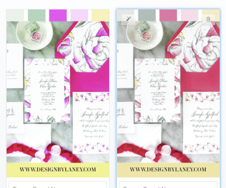
On the other hand, you should only use CMYK colors for printing. This is because you will have paper, or some other material, absorbing some of the colors, instead of light projecting the colors on a screen.
Alright, so now we know why we use CMYK colors for digital printing and RGB colors for on-screen projects. But how do we find best CMYK colors for printing? Especially when we’re using 2 different systems – our computer screens are showing us additive colors, but the end result is on paper that’s using subtractive colors. How do we match colors for printing?
Printing in CMYK Colors
First, let’s understand the limitations of CMYK color printing. When you shine light from a screen through colors, you get a wider spectrum of color. This is why you can see really great neon, bright, rich colors on screen sometimes, and then when you print them out…they don’t look so great.
That is simply a limitation with CMYK printing. You can avoid this in printing by using specially-formulated inks that are shiny or metallic or neon. But if you’re just using standard CMYK ink digital printing, you won’t be able to get colors quite as bright as you can see them on screen.
Here’s a rendering of the CMYK spectrum vs. the RGB spectrum from Miller Design and Marketing:
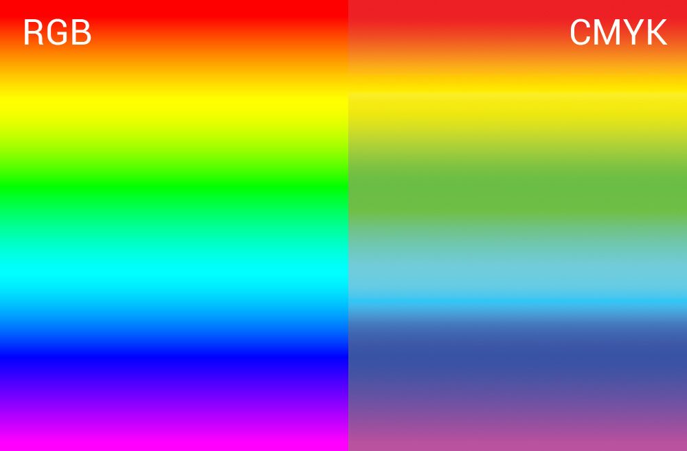
You can see that some of the colors look a bit duller or more gray. The brightest CMYK colors are not the same as the brightest RGB colors. So keep this in mind when printing CMYK images. You’ll still be able to print beautiful images, but you should understand the limitations of this color space if you want to get into graphic design or digital printing. Now let’s discuss how to make your CMYK prints look like you want them to!
CMYK Color Matching for Digital Printing
You’ve likely heard of PMS or Pantone colors. Pantone is the premier resource for color mixing. It’s used for Letterpress printing, screen printing, offset printing, and all kinds of color mixing. If you mix a color using the ratios determined by Pantone, and certified inks, it’ll come out to the color that you want – no matter what. A million printers around the world could mix that color, and it would always look the same.
But why don’t Pantone colors work for Digital Printing?
Great question! Pantone colors don’t work for digital printing very well because we don’t have complete control over the colors that are mixed together. If I could get inside my printer and control which ratios of ink are used, then Pantone color guides would work perfectly. But with digital printing, that’s not always the case.
Printing the same CMYK color codes on 5 different printers will likely yield 5 different results (sometimes, 5 verrry different results). Color variation in digital printing is really common, even amongst professional print shops.
When you give a professional print shop a PMS color to match, they’re not magically mixing the ink with that color code. Instead, they’re adjusting their digital print colors until the result matches the Pantone color that you gave them. It’s a valid way to do things – but it’s not super efficient when it comes to color matching digital printing.
Plus, if you order prints for the same project from multiple printshops (or like me, if you print some pieces in-house and outsource some of them) then you might have inconsistencies in your colors. Personally, that’s not really an option for my stationery clients, so I had to find a solution to get the best CMYK colors for printing.
Color Matching CMYK for Digital Printing
So how can you color match for digital printing? First of all, you should always understand that there will be slight variations with digital printing. The ink levels in the printer, type of printer, humidity, or stock you’re printing on are all things that can affect the final outcome. Printing the same job on the same printer on different days could yield different results. If you want a guaranteed color in your prints, you should use offset, letterpress, or screen printing – all of which you can match to a Pantone Color Formula for precise results!
However, if you want to do color matching for digital printing, the best way to get generally consistent results is to print a sample print! If you can use the same printer and same stock that you’ll be using for your final project, you can generally see what the final result will look like in a sample. But samples are costly, take time, and don’t often show ALL the colors. So what happens if you print a sample and don’t like the color you’ve chosen? Do you have to print a sample with 15 different but similar CMYK values on it?
Printable CMYK Color Palette
I searched for years for a large printable CMYK color palette that would make this process easier. All I’d need to do is print it out from my main printshop, and then I could always match colors to it. Unfortunately, this doesn’t really exist. Pantone does have the CMYK Color Bridge, which is supposed to show what CMYK values correspond to their PMS colors. But like I mentioned, the same CMYK value can print hundreds of different ways on hundreds of different printers.
Here’s a photo of how the same green CMYK values printed on the 3 different printers that I use most often – totally different!
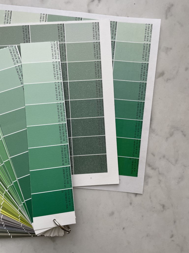
This is where I started to realize that I might just need to create this giant palette. I thought about it for about a year, and then once I’d had about 1,036,247 instances where I needed this thing, I figured it was time to put together a giant color chart for printing!
Printable CMYK Color Chart PDF
Enter The Printable Palette – a printable CMYK color chart that you can get printed on any printer you use, or with any print shop you use, as many times as you want or need to. It’s got about 1,500 swatches on it, a new burgundy and navy blue update, and each swatch contains PMS values, CMYK values, and RGB values.
You can use The Printable Palette as a CMYK color guide to color match for any digital print job. If you want to match an envelope color? Simple! Want to match a company’s logo in digital printing? Easy! Really like this random color of gummy bear you found and want to match it for a client project? Lemon squeezy (did you know I designed a font with this name, I do love yellow!) with The Printable Palette.
As a reminder, this isn’t a tool for color mixing – you’re not guaranteed to get the same results from every printer or on every type of stock. But if you want your end projects to match each other from different printers, if you’re printing in-house, or if you want to match to something you have in person – this is your tool.
@designbylaney How to color match your prints with The Printable Palette 👌🏽 #MACscaraface #designer #graphicdesigner #weddinginvitations #weddingplanning #bride
♬ original sound – Design by Laney
Here’s an example video of me trying to match some invitation prints to the envelopes that we ordered! (Click this link if video doesn’t load)
How does the Printable CMYK Color Chart Work?
The Printable Palette works like this:
- Print the chart of CMYK colors from your main print shop (on in-house your preferred paper)
- Whenever you’re designing, reference the color that you want from the printed copy
- Note the CMYK color code of that color, and employ those CMYK color codes for printing within your design file
- That’s it! Your printer or print shop will print, and the end result will be just what you were looking for (not a total surprise color!)
More tips: The Best CMYK Colors for Printing
When it comes to printing in CMYK there are a few rules you should follow!
Rich Black CMYK
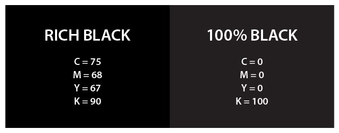
If you’re printing in CMYK, and K stands for black – you probably would think to just print 100% K for your black design elements. It’ll look fine on screen, but your black prints may feel a little lacking when you see them in person. This is because you’re only using one of the 4 print colors available to you! Mix in a little bit of Cyan, Yellow and Magenta, and you’ll get what’s called “rich black” which is a lot nicer.
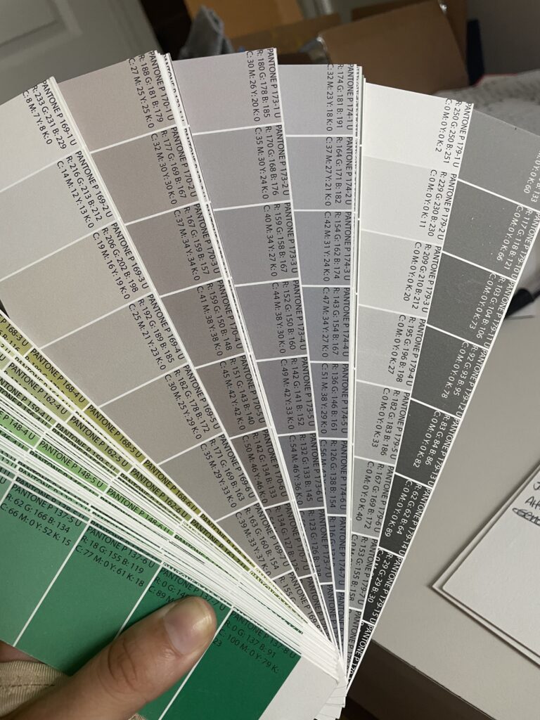
Rich Gray CMYK
The same goes for gray colors! It seems like you should just do 50% black or something, but that will leave things a little spotty. You’ll want to use a rich gray color code for printing. The problem with gray is that there are a lot of different variations, depending on which mix of the other 3 colors you use. If you use too much yellow, your gray can look green. If you use too much magenta, it can look purple! Here are a bunch of different gray swatches (all from The Printable Palette!) that show variations. The right-most section is all just using 0% CMY and some percentage of K – you can probably tell it’s a little spottier than the others which look…well…richer. These are all printed from my favorite wholesale print shop for stationery designers, PrintsWell Fulfillment!
Printing Blue in CMYK
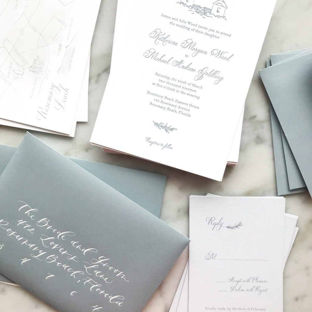
Blue is probably the hardest color besides gray to print in CMYK. It’s also one of the most common wedding colors, especially the “perfect dusty blue” that has been tough to create for many of my clients.
Here’s a photo of the most common dusty blue envelope that we use…and here’s a screenshot of the exact match to that color on my screen. Looks so different on screen, right? It also might look a little different on your screen than mine (here’s a photo of all the different dusty blues I printed to get the right one…this was kind of the precursor idea for The Printable Palette!).
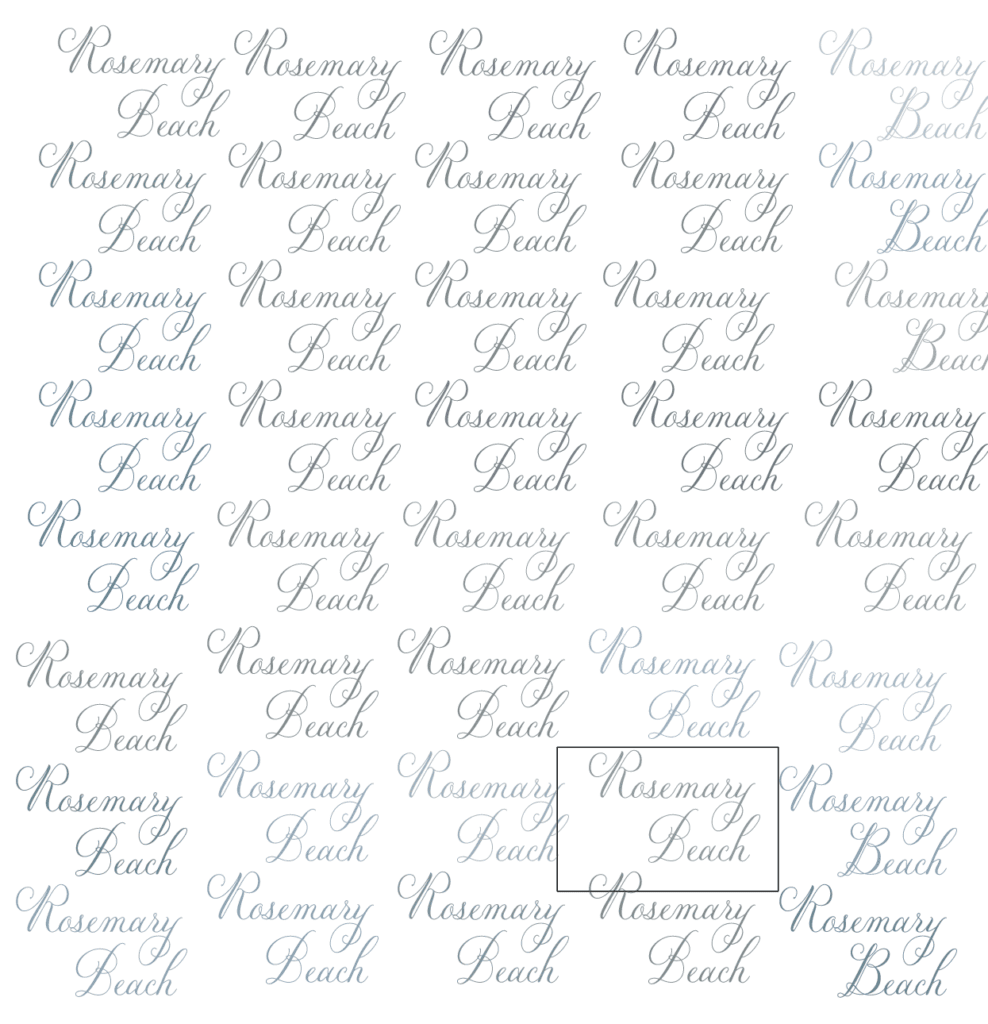

The key for blues is to not add too much magenta, because it’s easy for your blue to end up looking a little purple.
I really like this guide from Print Ninja with some sample CMYK values!
Best CMYK Red for Printing
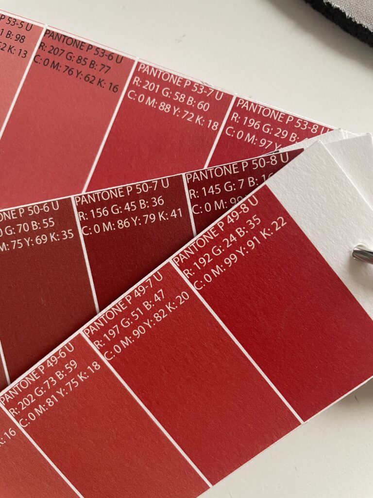
It’s tough to print red in CMYK – it often doesn’t appear vibrant enough on screen. As I mentioned before, every print shop will print CMYK colors a little differently, but here are a few of my favorite red options to use. This version of The Printable Palette was printed by my favorite invitation printshop (PrintsWell Fulfillment). The top CMYK code for a solid, bright red is 0 99 91 22.
Pantone to CMYK Conversion
There’s no 100% guaranteed way to convert Pantone colors to CMYK, because as we mentioned above, all CMYK printers are not created equal. However, you can get Pantone colors to convert to the CMYK color you want it using the same printer and paper. How do you do that?
How to Convert Pantone to CMYK for Digital Printing
If you select the Pantone color that you want, and then find the color on your printed copy of the Printable Palette that most closely matches it, then voila! The PMS value on the printed copy may be different than the PMS value on your PMS Formula Guide. This just means that your CMYK printer isn’t totally accurate to PMS colors, and that’s okay! The accuracy of your printer isn’t exactly key here since you have the Printable Palette to guide you!
The important thing here is that you have a reference to the printed result – which is what you want anyway. So even if the listed PMS color is a bit off, you still know that those CMYK values, on that paper, from that printer/printshop – will give you the end result that’s close to the PMS value of your choice!
When printshops convert Pantone colors to CMYK, or when I try to do it on my in-house printer, we generally print a test print, then continue to adjust the colors, print more test prints, etc. until it matches. This printable color chart will get you pretty close if not exact on the first try!
PS – The Printable Palette has recently been updated with additional pages in Burgundy and Dark Blue – to make printing dark blues and dark reds even easier.
How to Find the Best CMYK Colors for Printing
Behind the scenes with your favorite Stationery Auntie Laney (and all the inside scoops!)
Not sure where you should start?
I gotchu
Just feeling it out?
Check out our 7 Day Invitation Design Crash Course!
Ready to Start?
Our signature beginner's course From Start to Suite is perfect for you! It's literally *everything* you'll need to get started as a stationer!
Ready to Scale?
Join Stationery School for continuing education with 100+ lessons and new ones released monthly!
[…] color images, such as photographs, can be produced with cmyk colors. For stationery and logo design, pantone colors should be used. A Pantone color is essential to […]
[…] is the difference between RGB and cmyk colours and their applications? Color mixing is performed in both RGB and CMYK modes when using a graphic […]
[…] Reference 1 […]
[…] Reference 1 […]
[…] Reference 1 […]